
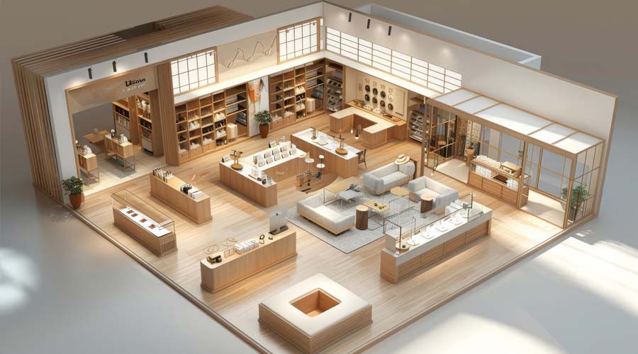
Retail store interior design shapes buying behavior in ways most shoppers never consciously notice, from the path they naturally walk through a space to how long they linger near a particular display. Unlike a home or office, a retail space has one clear job beyond looking good: guiding people toward a purchase decision, and every layout choice either supports or undermines that goal.
Designing the Path Customers Actually Walk
Most shoppers follow a fairly predictable path through a store, often influenced by which direction they naturally turn upon entering and where the eye is drawn first. Understanding this natural flow allows a layout to place high-margin or seasonal items where customers are most likely to pass, rather than tucking them into corners that see little foot traffic.
The entrance itself deserves particular attention, since the first few steps into a store set expectations for everything that follows. A cluttered or confusing entry can cause customers to rush past key displays entirely, while a clear, inviting first impression encourages them to slow down and actually look around.
Read more: Kitchen Layout Ideas for an Efficient Home Design Project
Balancing Product Density with Breathing Room
There’s a natural tension in retail design between showing enough product to feel abundant and leaving enough open space for customers to move comfortably and actually notice individual items. A space packed too tightly with merchandise can feel overwhelming, making it harder for any single product to stand out, while too much empty space can make a store feel understocked or uninviting.
The right balance often depends on the brand positioning — a discount retailer might lean into density to signal value and variety, while a premium boutique typically uses generous spacing around fewer, more carefully curated items to reinforce a sense of exclusivity.
Using Lighting to Direct Attention
Lighting does more work in retail than almost any other design element, actively directing where a customer’s eye goes first. Brighter, more focused lighting on featured displays draws attention naturally, while dimmer general lighting throughout the rest of the store creates contrast that makes those highlighted areas stand out even more.
Color temperature matters too — warmer lighting tends to make spaces feel inviting and is often used in categories like home goods or apparel, while cooler, brighter lighting is more common in settings like electronics or grocery, where clarity and visibility take priority over ambiance.
Creating Moments That Encourage Interaction
Retail spaces that perform well tend to include designed moments that invite customers to touch, try, or interact with products rather than simply walk past them. A well-placed table for browsing, a mirror positioned near apparel, or a demonstration area for a featured product all encourage the kind of hands-on engagement that moves someone from passive browsing toward an actual purchase decision.
These interaction points work best when they don’t feel forced into the layout, but rather appear as a natural pause point along the path a customer is already walking.
Fitting Rooms and Checkout as Design Priorities, Not Afterthoughts
Fitting rooms and checkout areas are often treated as purely functional necessities, but their design meaningfully affects the customer experience and, in turn, conversion. A fitting room that feels cramped, poorly lit, or difficult to find can turn a customer away from a purchase they were otherwise ready to make, while a well-designed one can actively support the sale.
Checkout areas benefit from similar consideration — a clear, unobstructed path to the register reduces friction at the final moment of a purchase decision, when even small hesitations can lead a customer to abandon items rather than complete a sale.
Read more: How to Brief Your Interior Designer for the Best Results
Reflecting Brand Identity Through Materials and Layout
A retail interior should feel like a physical extension of the brand it represents, using materials, color, and layout choices that reinforce what the brand stands for rather than following generic retail conventions. A sustainable, eco-conscious brand might lean into natural materials and visible sustainability cues, while a tech-forward brand might favor clean lines, minimal color, and a more futuristic material palette.
This consistency matters because customers form impressions quickly, and a mismatch between a brand’s marketing and its physical space can undermine trust before a purchase decision is even made.
Designing for Conversion, Not Just Aesthetics
The most successful retail interiors balance visual appeal with a genuine understanding of how customers move, browse, and decide to buy. A beautiful store that doesn’t guide customers naturally toward key products or make checkout easy is ultimately working against its own commercial goals, no matter how well it photographs.
At Intro Kreasi, retail projects begin with understanding the brand and how customers are expected to move through the space, so the final design supports actual sales performance alongside strong visual impact.