
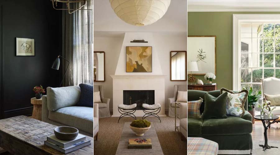
An interior design color palette shapes how a space feels long before anyone notices the furniture or layout. Color sets the mood of a room in a way few other design decisions can, influencing whether a space feels calm, energetic, spacious, or intimate. Yet choosing one is often where clients feel least confident, caught between wanting a space that feels personal and worrying about getting it wrong.
Start with How the Space Should Feel
Before looking at swatches, it helps to define the mood you’re aiming for. A living room meant for relaxing in the evenings calls for a different palette than a home office meant to keep you alert and focused. Warm, muted tones tend to create a sense of comfort and calm, while cooler or higher-contrast palettes often feel more energizing and clean. Starting with the feeling you want rather than a specific color helps narrow the options without locking you into a shade too early.
Understand the Role of a Base, Secondary, and Accent Color
Most successful interiors work from a simple three-part structure: a base color that covers the largest surfaces like walls and flooring, a secondary color that appears on furniture or larger fixtures, and an accent color used sparingly for details like cushions, art, or accessories. This structure keeps a space cohesive while still allowing personality to come through in smaller, more flexible elements.
The base color typically carries the most weight in setting the room’s overall tone, so it’s worth spending the most time getting this one right, since secondary and accent choices are easier to adjust later without repainting an entire room.
Consider the Room’s Natural Light
Light changes how color reads on a wall throughout the day, which is why a palette that looks perfect in a showroom or on screen can feel completely different once applied at home. Rooms with abundant natural light can generally handle deeper or more saturated colors without feeling closed in, while rooms with limited light often benefit from lighter, warmer tones that help the space feel brighter and more open.
It’s worth testing a color sample directly on the wall of the room it’s intended for, viewing it at different times of day, since morning light, midday light, and evening artificial lighting can each shift how a color appears.
Think About How Colors Will Age With You
A palette that feels exciting today should still feel comfortable to live with a few years from now. Trend-driven colors can be a fun way to add personality, but they tend to work best as accents rather than as a base color that covers large surfaces, since a bold statement color across an entire wall is far more noticeable to live with once the trend has moved on. Neutral or muted base tones tend to offer more longevity, leaving room to update the mood of a space through furniture, textiles, and accessories over time without a full repaint.
Don’t Underestimate Undertones
One of the most common mistakes in choosing a palette is overlooking undertones, the subtle secondary hues within a color that only become obvious once placed next to other elements in a room. A white that looks clean on its own might read as slightly yellow or gray once placed against certain flooring or furniture. Comparing samples side by side with the materials already in the space, rather than judging a color in isolation, helps avoid unexpected clashes once everything comes together.
Bringing It All Together
Choosing a color palette doesn’t need to mean picking the perfect shade on the first try. It’s a process of narrowing down a mood, testing how colors behave in your specific space, and considering how the palette will hold up over time rather than just how it looks in a single moment. Working through these questions with a clear sense of what the room needs to feel like makes the final decision far more straightforward.
At Intro Kreasi, color palette decisions are approached as part of the broader design process, developed alongside layout, materials, and lighting so that every element of a space works together rather than in isolation.